We often mention that our platform is optimized for businesses ranging from complete beginners to big corporate enterprises. We have a solid foundation that allows us to solve the needs of both starters and already-developed businesses that want to elevate their eCommerce game to the next level.
It’s not a surprise that a lot of the medium or big stores prefer to use professional design services (which we offer in-house or via our Growth Ecosystem) due to the stage of their development. For businesses that reached a higher level of growth, it is better to invest their time in growth development and other strategic initiatives and to let the professionals take care of their designs.
But for the smaller businesses or the ones that just want to quickly take care of something in their design or even stir up a new promotional landing page - we have our drag & drop page builder. Today, you will learn more about it and how to properly use its capabilities.
CloudCart’s Page Builder Overview
Let’s see what every functionality of the builder does, so you can hop into your CloudCart store and create your new landing pages that will charm their visitors with their design.
Access the builder under the “My Store” menu and then click on the Drag & Drop Page Builder button.

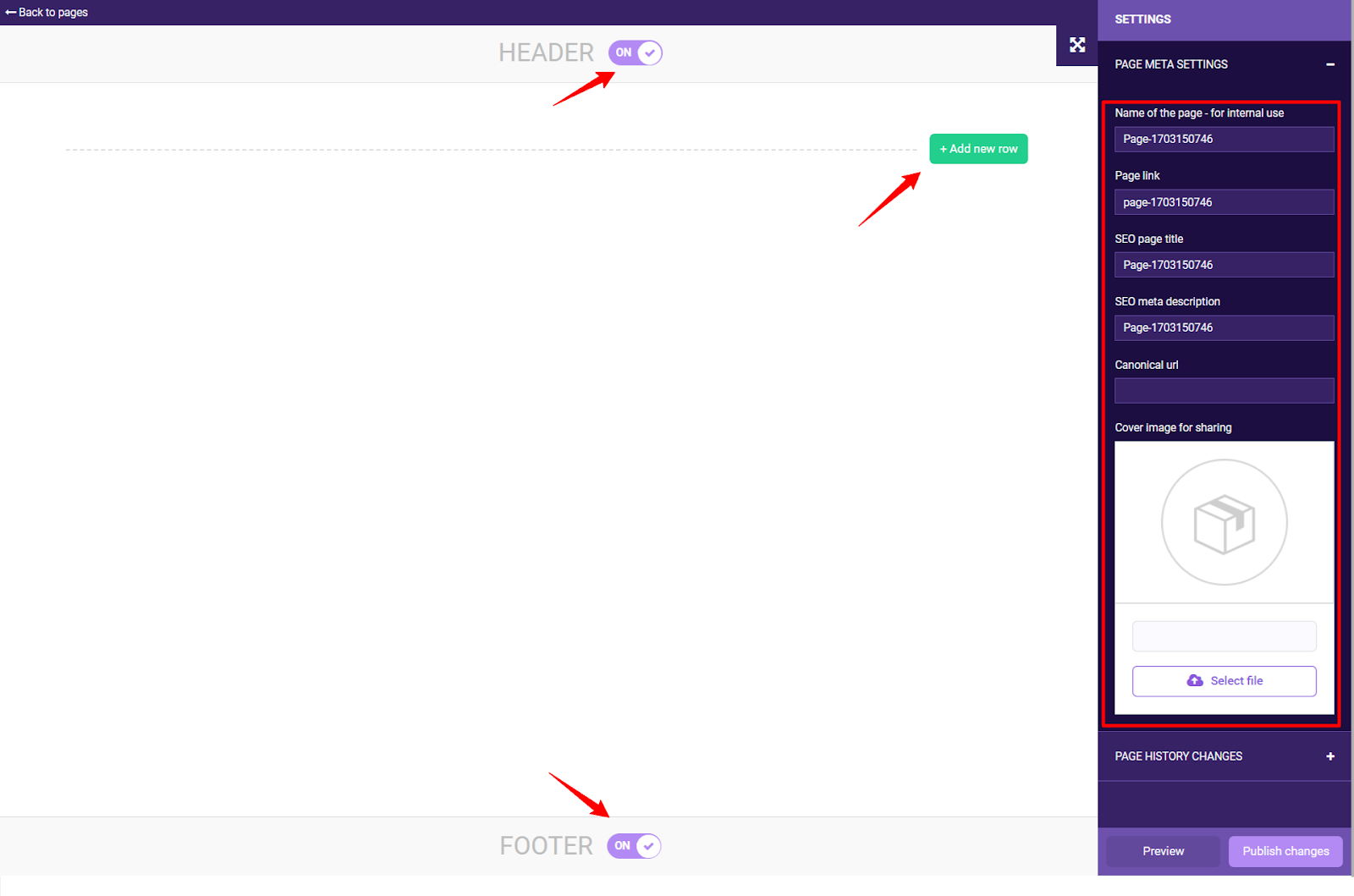
Then you can see the page builder layout, here you should notice a few important buttons.

On the right side, you can access the basic page settings like name, URL link, SEO title, and image for sharing. Using the green button “Add new row” you can add the layout that your page or section needs and then access all of our widgets which we will explain in a second.
Here, you should also consider using the on/off switches to hide your footer or header. This convenient functionality can increase your conversion rates, we have a dedicated mega guide on the topic of creating highly-converting landing pages, learn more here.
Now, let’s take a look at the most useful widgets that you can access via the page builder. In this article, we’ve explained all of them, here we want to share some ideas and point your attention to some specific use cases.
These are all of the widgets you can use.

Now, let's give you some tips on how to make the most of the available modules when creating the landing page you're working on.
Add Title & Add Text
When using titles and text there are a few key criteria that you have to keep in mind. First of all, stick to the brand style - keep the colors of the text, its sizing and the font consistent across the landing page and the rest of the website.
Also, keep well-structured visual hierarchy - the important text should be bigger and bolder, but not so much that it overwhelms the reader.
And finally, leave enough whitespace (empty) between each block of text and between the titles.
Product showcases & Brand/Category Showcases
Using such widgets is a must if you want to promote a wider range of products. When doing so, just keep in mind that you have to decide what structure you want to have for your layout - how many rows and columns should be displayed. A general rule of thumb is that if you show too many items at the same time, this can overwhelm the visitor of the store.
On the contrary, recent studies have shown that if you show a lot of products on a landing page, this can create a subconscious idea for the client that the store is of higher value. The best way to determine is to make A/B tests.
The image widget
Using this functionality is self-explanatory, here you just have to make sure that your images are the right size (the files shouldn’t be too big to slow down the store), the right proportions, and of course make sure that they match your brand identity and the purpose of the landing page.
By the way, you can order a set of banners to be made by our team, they will be the ideal addition to your landing page, to learn more about it - check this link.
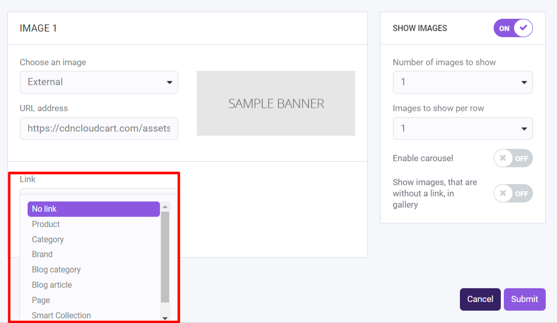
Also, don’t forget that you can add a link to the image, as shown below.

Add Code Snippets
In some cases, this Code Snippets functionality is live-saving. With it, you can enhance your page functionality or support your marketing needs.
Add Separator
This useful small widget can help you maintain your visual hierarchy and let your visitors focus on the important information.
Add Video
You can use this widget to insert videos from YouTube and Vimeo. Also, you can use the link or an embed code if you prefer.
Add Carousel
We are big fans of the carousels (also called sliders). Their worth is proven on multiple occasions, so pay attention to this widget and make the best of it. Something that you need to be wary of is that you should prepare a portrait and a landscape version of your images, so your carousels can be optimized for both desktop and mobile versions. And of course, add links to each slide, if that’s something that fits the concept behind the Carousel.
You also can access a Text Carousel, which basically does the same thing, but without the images.
Order details
This widget makes sense if you are building a custom thank you page. With it you can display the exact details of each customer's own order. To learn more about the potential of a well-crafted thank-you page, click here.
Bundles section
Another very important feature that you should use if you have already created bundles (and if you don’t, read this article to find what you are missing) is the Bundles section widget. It does what it says - your already prepared boundless will be displayed on the landing page.
Keep in mind that showing your product bundles on locations different than your product or check-out page is a good idea and can improve your conversion rate.
Instagram photos
This one is self-explanatory - it will show photos from your Instagram feed.
Yotpo reviews
If you are using Yotpo (a powerful platform for customer reviews) you should consider creating more trust in your store by displaying your previous customer reviews. Using the Yopto widget is one of the best ways to do exactly that.
Product
The classical product widget will display a certain product with detailed information about it. Using this tool helps you create custom landing pages for your important products, so you can experiment with their messaging, design, and much more.
Buttons widgets
With this widget you can add simple buttons leading to inner pages of the website (and you should) to your landing page and personalize them with custom CTAs or you can even add a button that adds the product directly to your customers cart.
Articles
If you have a blog for your store, this is the widget that will display your posts on the landing page. In the cases, when the user needs a little more “education” about your product, this widget is very useful.
Product reviews
Use it to prominently display your product reviews. As mentioned in our guides for CRO and AOV increasing, your positive reviews left by previous customers are something very important and you should leverage them.
With this widget, you can do it easily, don’t take it lightly.
Ask for feedback
Asking for feedback is the way to get plenty of feedback for your products, so you can later display them with product reviews. The idea is simple, but a lot of the merchants shy away from asking for feedback or they are worried about the technical implementation. With this widget, you won’t have to worry about that.
Choice of delivery location
To be able to use it, you need to have the “Store Location” app installed for your store. With this combination now you can create a custom landing page that enables your users to share their delivery location. This way you can unlock for them a personalized experience with your store (for example by showing them only relevant products, related to their delivery location).
Embed subscription form
Maybe this time you are not building a sales page but a lead generation page. In this case, you will need a way to gather those leads contacts. The solution is simple - just embed your dedicated subscription form and you are good to go.
With this last widget, we are going to wrap this up and wish you a happy designing.
Of course, if you need something custom to be built for your store, or a helping hand with your design, banners, carousels, or whatever - don’t hesitate to reach out to our team because we are here to help.
Gallery
Sign Up for Our Newsletters
Stay up to date with all industry news, trends and hacks. Subscribe and unlock discounts, content and perks.
Latest posts
You May Also Like
View All

.webp)
.jpg)
.jpg)


